

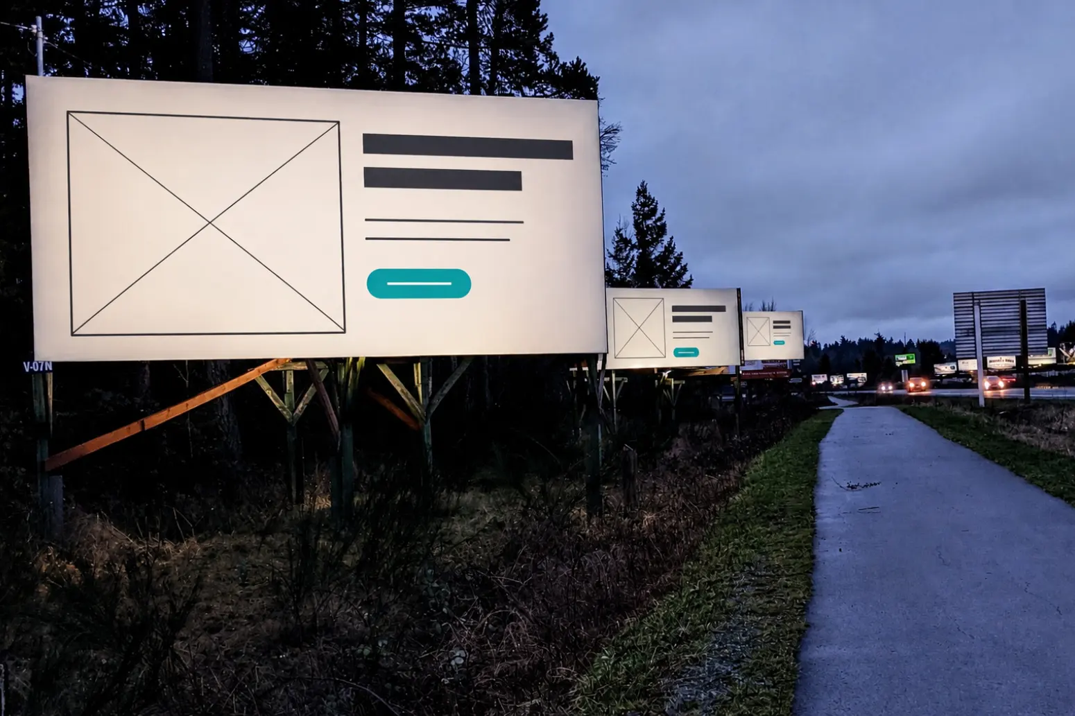
If you’ve ever driven from Victoria, BC, to the Swartz Bay ferry terminal, you may remember passing through a distinctive stretch of highway near Sidney lined with billboards for local businesses.
I drove that stretch for years. At 100 kilometres per hour, I never had time to study the billboards. At most, I had enough time to read a headline and a URL. But the better designs still told me who was advertising, what they were selling and why I should care.
One day, I realized this was also a pretty good way to think about newsletters.
Most people don’t open a promotional email because they’re excited to settle in for a long read. They glance at it, decide whether anything looks interesting and either click or move on to the next email.
Your newsletter has a few seconds to make its case.
I’ve spent a lot of time thinking about email
I started designing and building emails at AbeBooks early in my career. That meant testing responsive layouts, troubleshooting across email clients and ripping my hair out at the many creative ways Outlook could destroy my perfectly reasonable HTML.
Later, my time at Sendwithus exposed me to some exceptional email programs. One of my favourite examples was Uber’s receipt email. Even a decade later, it still impresses me. Trends come and go, but Uber delivered a truly timeless design.
The email included a map of your route, information about your driver and links to rate the experience. It combined real-time data with genuinely useful information, all organized around what someone wanted immediately after completing a ride.
It was sophisticated and timely, and it got straight to the point.
This template follows a great rule for transactional design: it isn’t necessarily simple behind the scenes. It just feels simple to the person receiving it.
For most transactional emails, shorter is better: a clear headline, a small amount of useful copy and an obvious next step.
Promotional newsletters have a different job, but I’ve found that the same respect for people’s time generally applies.
Most inbox attention is drive-by attention
Sometimes long-form email works. If the writing itself is the product—or the sender has an audience that genuinely wants to hear from them—it can work extremely well.
But that isn’t how most promotional newsletters are received.
For those emails, I’ve had repeated success using what I call the Billboard Theory of Newsletter Design:
One strong visual. One clear headline. One short blurb. One obvious place to click.
Basically, a card.
The image earns attention. The headline communicates the idea. The copy provides just enough context. The button gives the reader somewhere to go.
Anything else has to justify the space it occupies.
Replacing the founder letter
I applied this approach while working at Button.
The company’s newsletter originally opened with a long “from the founder” message. It required a substantial amount of attention before readers reached the content and links we actually wanted them to engage with.
I was asked to improve click-through rates, so I replaced that opening with a template built from visually engaging cards. Each contained a strong image, a concise headline, a short description and a clear button.
Newsletter click-through rate increased by approximately 20%.
This wasn’t a controlled experiment, and I wouldn’t claim that every company could make the same change and achieve the same result. Audience, subject matter, timing and the strength of the offer all influence performance.
But the improvement was meaningful, and the reasoning behind it was simple: we got straight to the good stuff.
The pattern worked again
I later used the same approach at a Canadian outdoor retailer with similar results.
Its ecommerce newsletters were long, visually inconsistent and sometimes tried to promote too many things at once. Some performed reasonably well. Others didn’t. Almost all of them were difficult to scan.
I simplified the structure into a series of focused, billboard-style cards, and the emails became cleaner, easier to produce and easier to understand.
More importantly, they stopped looking like someone had tried to fit the entire store into a single newsletter and click-throughs increased.
Where the theory doesn’t apply
The Billboard Theory isn’t a rule for every email.
A personal essay, editorial newsletter or thoughtful message from a founder may need room to develop an idea. A transactional email may need to display account information, order details or other useful data. Some audiences will happily read thousands of words from a sender they trust.
The theory is specifically for promotional newsletters whose primary job is to earn a click.
It also isn’t an argument for making email shallow. The landing page can contain the complete story, detailed product information or a deeper explanation.
The newsletter’s job is to make someone want to get there.
The 100 km/h test
When reviewing a newsletter, I ask a few simple questions:
- Can I understand the main idea within a couple of seconds?
- Is there one obvious visual starting point?
- Does the headline make sense without the body copy?
- Can I immediately see where to click?
- Is anything competing with the primary message?
If the email only makes sense after someone carefully reads three paragraphs, it probably won’t survive a busy inbox.
After years of designing emails across ecommerce, SaaS and enterprise organizations, the Billboard Theory is the pattern I keep returning to.
One image. One headline. One button.
At 100 kilometres per hour, that may be all the time you get.
