

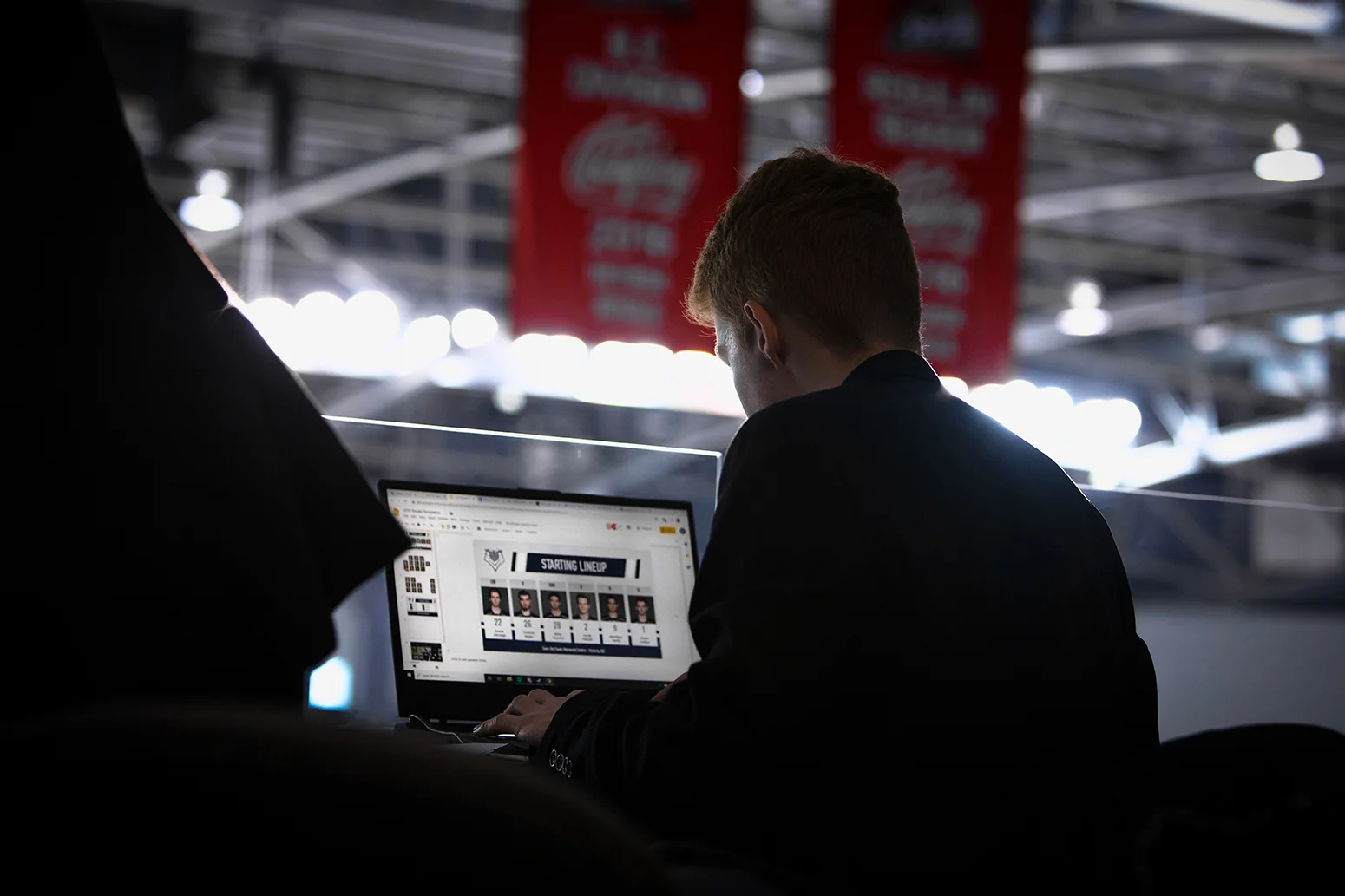
One of the most useful design lessons of my career began with a badly lit iPhone photo of an 8.5-by-11-inch sheet of printer paper.
In 2019, while working as Manager of Creative Services for the Western Hockey League’s Victoria Royals, I ran an A/B test on the team’s starting-lineup graphic. The reimagined version B increased social media engagement by 39%.
It was the clearest test result I had ever produced, and it’s a win I include on my résumé to this day. But as the test continued, those gains began to fade, and my seemingly conclusive result revealed some unexpected truths about design and human nature.
So what happened?
Before joining the Royals in 2018, I had spent much of my career working in enterprise UX and B2B startup marketing, where A/B testing was often more exciting in theory than in practice. My coworkers and I would change a headline, adjust a layout, or try a different call to action based on a simple hypothesis, then wait for enough traffic to determine whether the change had made any difference.
Usually, the result was a shrug. The audience was too small, the improvement was too slight, or the test needed to run longer than the business could reasonably wait. Even when a hypothesis was clear-cut on paper, there often wasn’t enough evidence to support a confident decision.
That changed when I joined the Royals.
Working for a hockey team had been a childhood dream, and one of the things that made the job so compelling was access to something most B2B companies can only dream of: a large, emotionally invested audience that was absolutely ravenous for content.
For the first time in my career, I had an environment where I could test creative ideas and generate enough feedback to reach meaningful conclusions.
Turns Out Sports Fans Are Fanatical
Victoria, BC, is a savvy hockey city, and Royals fans scrutinize everything the team puts out. Every social media post we published generated thousands of views and plenty of clicks, likes, comments, and shares. Those interactions weren’t the same thing as ticket sales or revenue, but together they created a steady stream of behavioural data that you just don’t see in the B2B space.
As I began digging through the numbers to see which content fans found most engaging, some of the results were predictable. Big wins, player milestones, and major team news usually performed well.
But one result surprised me.
Despite being less visually interesting than much of the Royals’ other content, the starting-lineup graphic for each game consistently ranked among the team’s most engaging posts. For those unfamiliar with hockey, this is a graphic shown on the arena jumbotron before puck drop and shared on social media shortly afterward.
Even more surprising, the post with the strongest engagement of all was a follow-up photo of the game’s official roster sheet, taken in a hurry with a smartphone. A roster sheet is a compliance document that coaches submit to game officials before every game to confirm the lineup with the league.
It was literally a picture of a piece of paper with scribbles on it. And somehow, it was social media gold.
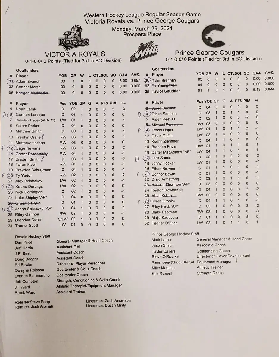
Not very pretty, is it? But the photo contained information fans wanted at exactly the moment they wanted it. Who was playing? Which goaltender was starting? Who was missing from the lineup? Which players were on a hot streak? Who was starting for the opposition?
The more I thought about it, the more I accepted what the engagement data appeared to be saying. It made sense. Roster turnover in junior hockey is much higher than it is in the pros, which meant even die-hard fans would have a hard time keeping up with who was playing on any given night.
The roster sheet answered questions quickly, suggesting that fans valued timely, factual information more than visual appeal.
That sucks to hear as a designer who frets over pixels all day, but it’s the truth.
Even so, the stubborn designer in me wasn’t ready to accept that a photo of a piece of paper was the best possible solution. Surely I could take the same information, present it in a better-looking starting-lineup graphic, and push engagement even higher.
So, as I often did in this type of situation, I turned to NHL teams for visual inspiration.
Unsurprisingly, their starting-lineup graphics were much more sophisticated, with player headshots front and centre alongside other visual flourishes.
The Royals’ existing template, by comparison, was little more than a list of names and jersey numbers. But that simplicity served a practical purpose.
Reality Enters the Chat
Designing for fans was only half the problem. The graphic also had to be simple enough for anyone on the team to update minutes before puck drop.
Junior hockey teams don’t have the creative resources of NHL organizations. On a typical game night, I shared social media duties with the Royals’ Director of Hockey Operations and a couple of media interns, all of us working inside a loud, boisterous 7,000-seat arena. The starting lineup wasn’t confirmed until minutes before puck drop, when everyone was already juggling other responsibilities.
That meant speed and ease of use mattered just as much as appearance, especially for teammates without professional design training. There was no time to open Photoshop, dig through a complicated layered file, and carefully position every element as I might with a less time-sensitive graphic.
The existing template reflected those constraints. It was built primarily from editable text fields, which made it visually plain but fast and easy to produce.
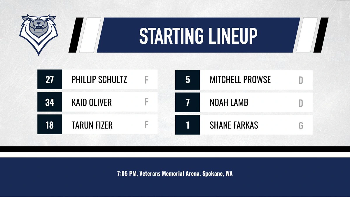
Still, I was determined to add player headshots without sacrificing that simplicity. The NHL examples had shown me what an improved graphic could look like, and something I’d learned nearly 20 years earlier in a university course on sensation and perception helped explain why it might work.
Faces Are Hard to Ignore
The human visual system is remarkably sensitive to faces. Our brains detect and recognize them almost instantly, even at a distance, which makes them especially effective at capturing our attention. This effect is familiar to marketers who have seen eye-tracking studies, but it felt particularly relevant in sports, where faces do more than simply attract attention.
Fans don’t form emotional connections with lists of names or jersey numbers. They connect with the people behind them. They recognize players, follow their stories, and choose favourites.
I believed that combination of instant recognition and emotional connection could make the starting-lineup graphic more engaging.
So my direction became clear. I needed to preserve the timely information that made the roster-sheet photo useful and the simple workflow that made the existing template practical, then add the player faces that made the NHL graphics so compelling.
But I didn’t want to make the change and call it a day. My B2B experience had taught me to test assumptions rather than rely on instinct alone, and this was the perfect opportunity to do that.
My hypothesis was simple: adding faces to the graphic should increase engagement. I felt confident it would. The real question was by how much.
But before I could run the test, I needed to build a face-forward template that anyone could update minutes before puck drop.
Google Slides to the Rescue
The solution came from one of the least glamorous design tools available: Google Slides.
Dedicated templating software is common in the tech world, but a specialized subscription wasn’t realistic for a junior hockey team’s budget. Google Slides was free, familiar, and already accessible to everyone involved. There was no new software to purchase and almost no learning curve.
I added the player headshots to a Google Slides file and turned it into a reusable template. The workflow remained largely unchanged: anyone could open the file, copy and paste the appropriate photos into place, update a few text fields, and export the finished graphic quickly.
With the template ready, the experiment took shape. The Royals’ existing text-based graphic became version A. Because it had already been published before every game, I had a substantial amount of baseline engagement data.
The new face-forward template became version B. It preserved the same lineup information and simple workflow as version A, but put the players themselves front and centre, much like the NHL graphics that inspired it.
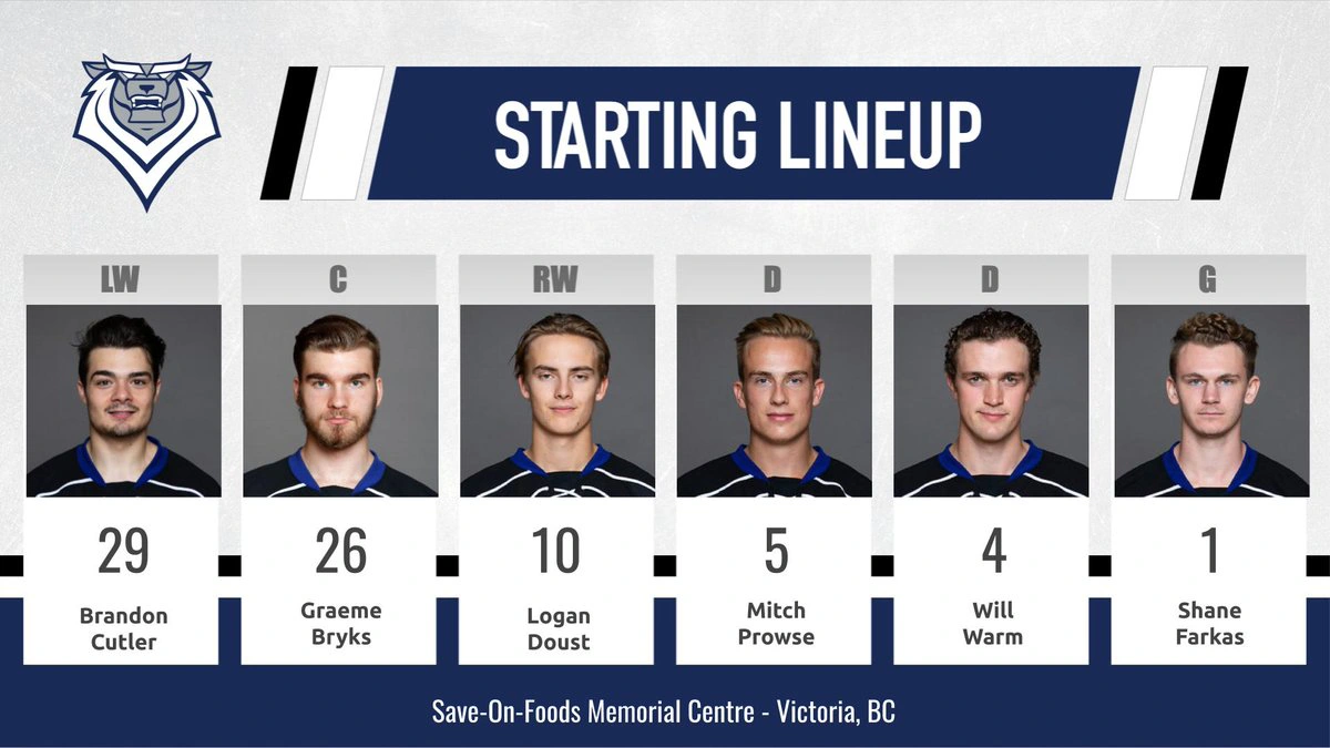
I introduced version B about halfway through the season and continued collecting engagement data over the months that followed.
Both templates delivered the same information, served the same purpose, and were published at roughly the same point before each game through the same social channels. The primary design change was the addition of player photos.
Because the two versions ran sequentially rather than simultaneously, this wasn’t a perfectly controlled experiment. The opponent, recent team performance, importance of the game, and point in the season could all influence engagement. Still, version A provided a substantial baseline, and collecting data across many games helped reduce some of that noise.
To measure performance, I combined the Facebook and Twitter data and calculated an aggregate engagement rate: likes, comments, and shares relative to views. Using a rate instead of raw totals helped account for differences in post reach and platform demographics.
Collecting enough data took nearly four months, a luxury I rarely had in B2B, where decisions often had to be made before a test reached a clear conclusion. But this time, I had the opportunity to see it through.
A Big Result. A Bigger Surprise.
When I finally tallied the results, version B had increased engagement by 39%.
Boom!
After years of ambiguous B2B tests, I finally had the clear answer I’d been looking for. Better still, the new template remained simple enough for anyone to use during the chaos of game night.
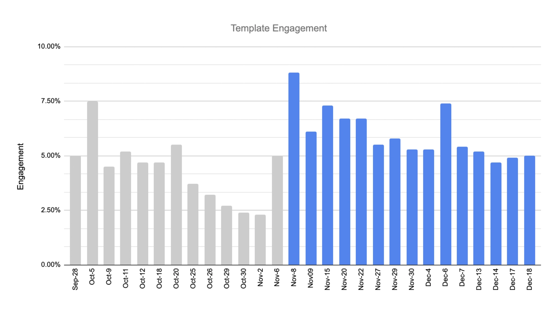
That could have been the end of the experiment: declare version B the winner and move on. But when I graphed the individual posts over time, another pattern became obvious.
Each template performed best near the beginning of its run, then gradually attracted less engagement as it was repeated. The face-forward template remained the overall winner, but its advantage steadily shrank with repetition.
Winning Templates Have a Shelf Life
Once I saw that pattern, I found it everywhere. And I attributed the most likely explanation for the decline to habituation, a psychological process in which repeated exposure to the same stimulus gradually weakens our response to it. Although the template improvements remained useful and the design itself was more appealing, repetition had made the template increasingly familiar and easier to overlook.
Adding faces had worked, just not entirely on its own. Novelty had amplified the engagement gains, and I hadn’t accounted for how quickly that advantage might fade over time.
That insight became the biggest takeaway from the experiment and has shaped how I approach social media testing ever since.
Humans are novelty-seeking machines. An A/B test can identify what works under a particular set of conditions, but it can’t tell you how the audience will respond once the winning version becomes familiar.
Once I understood that, a follow-up experiment seemed obvious. I wanted to introduce home, away, and special-event versions of the winning template, each mirroring the team’s corresponding jersey colours. They would preserve the structure and workflow we had established while adding enough visual variation to keep the design feeling fresh for longer.
Unfortunately, before I could test the idea, the COVID-19 pandemic cut the season short and ultimately brought my time with the Royals to an end. I never got to find out whether those variations would extend the template’s lifespan.
Even without that final test, the experiment had changed my understanding of engagement. The badly lit roster-sheet photo showed that timely information mattered more than visual polish, while version B demonstrated that stronger design could amplify that information without making the graphic harder to produce. And watching the results regress revealed that even a successful design can become invisible when an audience sees it often enough.
The experiment began with a question about whether I could improve a graphic. It ended with one I still carry into every test: once a design wins, how long can it keep winning?
