

I love maps. When I was little, my parents brought home an atlas of the world, and I pored over it obsessively until I became a tiny geography wizard. To this day, if a geography question comes up in Trivial Pursuit, you want me on your team.
I also love Rive. So when I wanted to improve my Rive skills, building an interactive map felt like an obvious project.
Rive occupies an interesting space between design and development. It feels like a throwback to the old-school days of Flash, when the web was a free canvas for experimentation. It lets designers move beyond static mockups and turn the ideas in their heads into working components.
That freedom is what draws me to it. At a time when so many digital products are assembled from the same component libraries and familiar screen patterns, Rive makes it possible to create something more expressive, tactile, and fun to use.
I had spent several months experimenting with Rive and following YouTube tutorials, but eventually I wanted to see what I could build without someone else showing me how. I needed a project complicated enough to push me beyond what I already knew.
A clickable map seemed perfect. Maps can reveal geographic patterns that aren’t always obvious in a traditional chart or table. They also naturally invite people to click around, compare regions, and see what changes from one place to another.
Plus, they’re just plain fun to explore.
My idea was simple. I wanted someone to be able to click a province and have the selection update a related chart. I didn’t have a client, business objective, or particular dataset in mind. I just wanted to build a reusable interaction and learn how Rive handled something more complicated than a basic animation.
Before I could do any of that, however, I needed a map.
Finding a Map Was Harder Than I Thought
I searched for an existing SVG map of Canada, but none quite worked. Some were paid assets. Others simplified the geography too much or combined the entire country into a single shape.
I needed every province and territory on its own clearly labelled layer, with enough detail for it to still look unmistakably Canadian. Eventually, I gave up looking and decided it was probably easier to make one myself.
I fired up Affinity Designer, put on my headphones, and spent the better part of eight hours carefully tracing the country. It was tedious at first, but after a while I found a rhythm and slipped into a satisfying flow state, something that has become increasingly rare in this age of prompting.
Click, click, click. Province by province.
I organized the finished file for Rive and released it as a free Creative Commons download. Hopefully, the next person who needs a detailed, layered map of Canada won’t have to spend eight hours tracing one.
Finding Data for the Whole Country
Once I had the provinces changing colour on command, the map technically worked. But it was also kind of pointless.
It needed something to do.
I wanted each selection to update a related chart, so I started digging through Statistics Canada for data. This was harder than expected. Many datasets covered the ten provinces but excluded one or more territories, and if I was building a map of Canada, I wanted all thirteen provinces and territories to have something meaningful to show.
I eventually settled on average earnings and owner-estimated dwelling values. Not because I had a grand theory about Canadian housing, but because the data covered the whole country and varied enough to make the chart interesting.
It was placeholder content, but I wanted it to be credible. Unfortunately, earnings and dwelling values use completely different scales, and every simple comparison opened another obvious data-science hole.
This is where working with AI helped. Hello, ChatGPT.
I used AI to challenge my calculations and explore different ways of normalizing the values, then checked each approach against the original Statistics Canada tables. Eventually, I converted both datasets into indices.
The result isn’t an academic affordability index, but it is real data shaped into a credible working example. The numbers could easily be replaced with election results, regional sales, hockey players, or anything else tied to a location.
The interaction was the reusable part. The data simply gave it something legitimate to say.
Making It Work in Rive
With the map and data ready, I imported everything into Rive and started building the interaction.
The idea seemed straightforward: add listeners to each province, connect the inputs, and use the selection to control the chart.
Rive had other ideas.
Some approaches worked inside the editor but broke when I published the file. Others created conflicts between provinces or turned the state machine into an increasingly complicated mess.
I spent about three days researching, testing, exporting, breaking things, and trying again. Eventually, I found an approach that worked reliably. It required more inputs than I originally wanted, but every province responded consistently and the map stayed synchronized with the chart.
It worked. I happily took the win.
The Finished Experiment
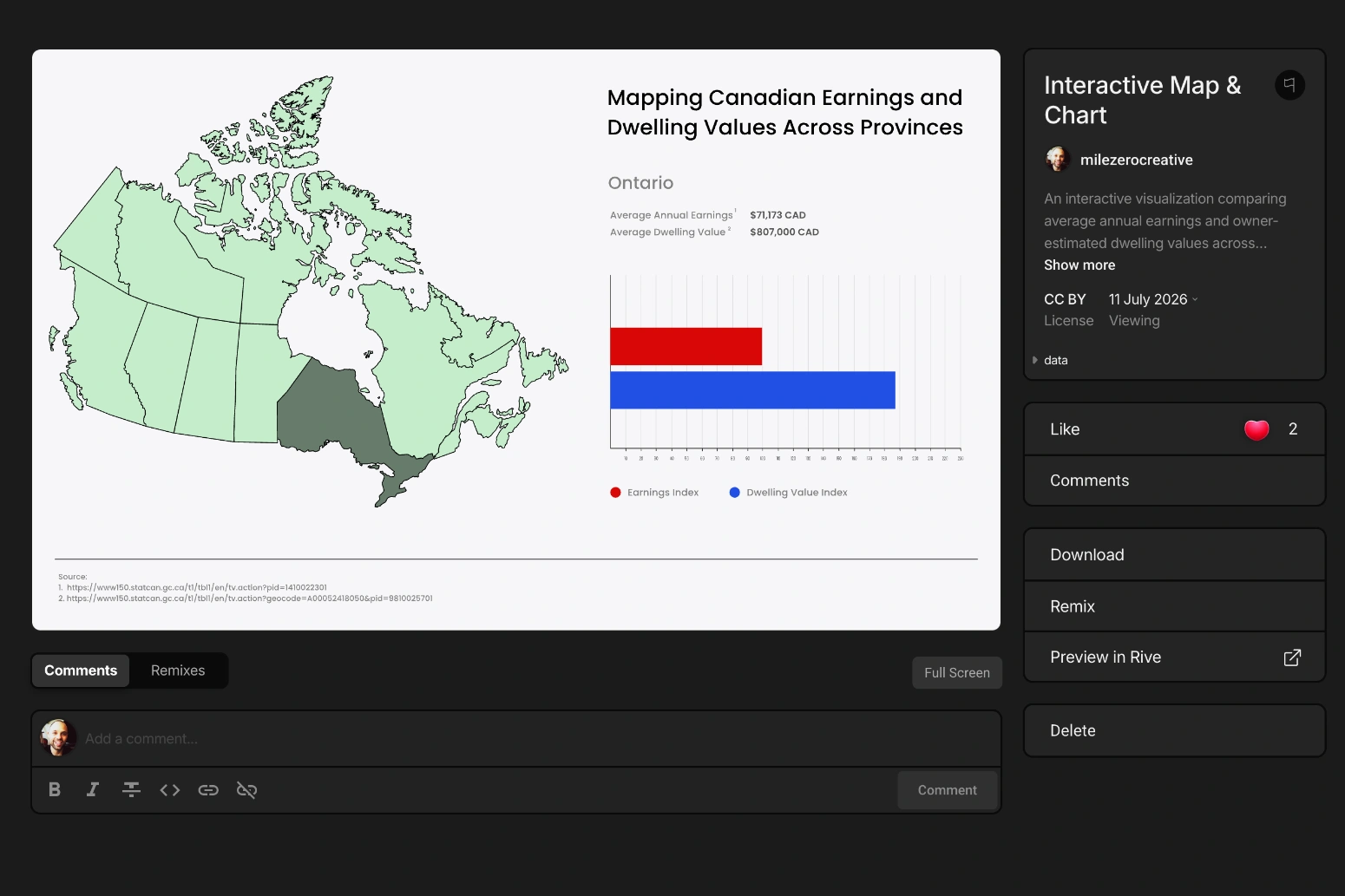
The finished project connects an interactive map to a data visualization. Selecting any province or territory updates the chart with its corresponding earnings and dwelling-value indices.
It isn’t a client project or a finished data product. It’s a working demonstration of an interaction I’d love to reuse when the right project or dataset comes along. If there’s enough interest, I may even turn the process into a tutorial.
For now, you can explore the component on the Rive Marketplace or download the SVG map and build something completely different with it.
Not bad for a project that started with “maps are neat.”
